Logo System
Two elements, one system.
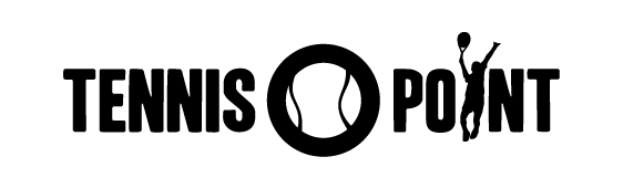
Wordmark
The full wordmark with integrated tennis ball. Primary brand identification.
Use for: Standard for all touchpoints: website header, documents, campaigns, print.
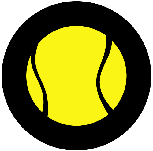
Ball Logo
The tennis ball as a standalone brand element. Compact identification.
Use for: As icon, favicon, app icon, social profile picture, or as reminder where the brand is already established.


Clearance Zone & Minimum Sizes
Reference Unit
1T = cap height of TENNIS in the wordmark. Reference edge is the full logo bounding box including silhouette and ball icon.
Minimum: 1T
Only when the format forces it. Applies to space-critical use cases.
Recommended: 1.5T
Default for hero and brand-presence applications. Reduce only when necessary, not out of convenience.
Minimum Sizes
Do / Don't
The logo's shape, color, proportions and clear space stay untouched. These alterations are not allowed.
Correct variant, clear space kept
Don't stretch or squash
Don't recolor
Don't rotate or tilt
No shadows, glow or effects
Don't violate the clear space
On dark backgrounds use the outline variant
No-Gos
Logo as watermark on every image
Logo on visually crowded backgrounds
Logo smaller than minimum size
Ball icon as substitute for the wordmark in formal contexts
Free variations of the claim ('Advantage Us', 'Advantage Tennis')
Claim fixed to the logo as a lockup - 'Advantage You' is used independently
Mixing color variants that are not defined as official variants
Using the white-only or black-only logo without yellow – technical exception only (engraving, embossing, b/w print). Yellow is a fixed brand component and is used whenever possible.